Dallas Arboretum and Botanical Garden
Brand & Identity Refresh
Role
Graphic Designer at Gatesman Agency
What we did
Visual Identity, Brand Positioning
One of the top botanical gardens in the world, the Dallas Arboretum and Botanical Garden, needed a refreshed brand identity that honored the beauty, charm, and unique character flourishing in Dallas.
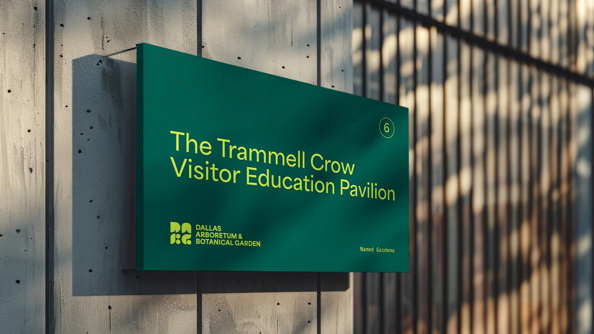
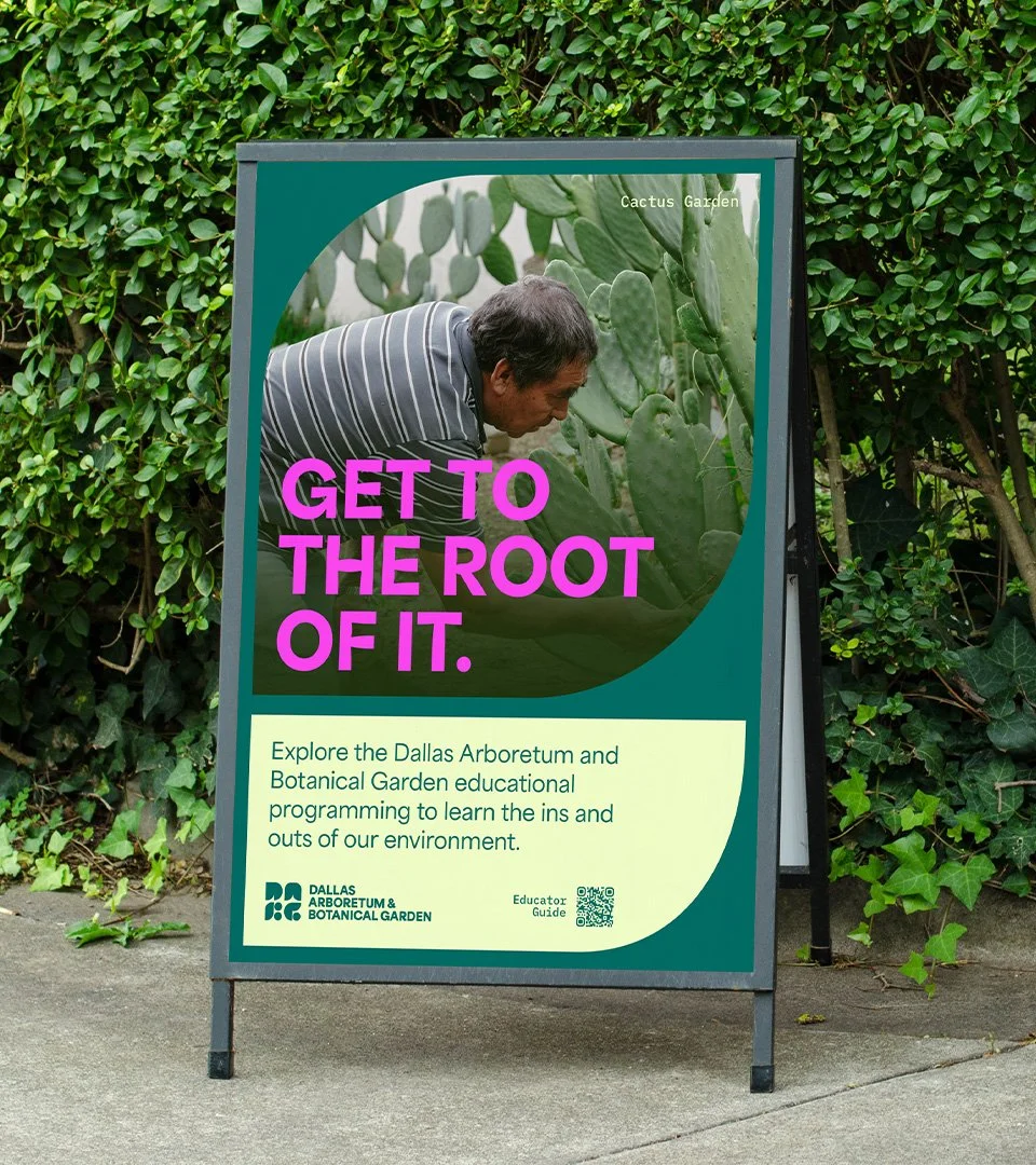
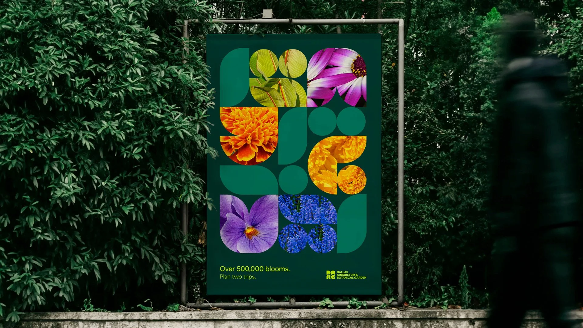
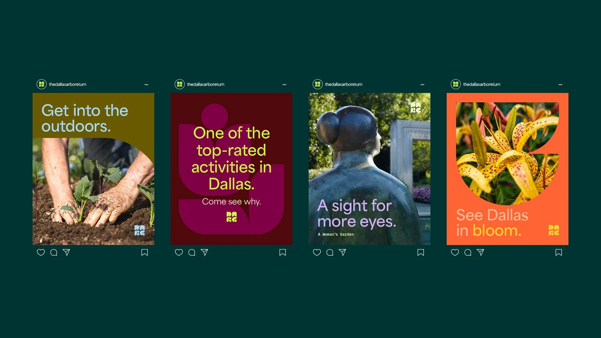
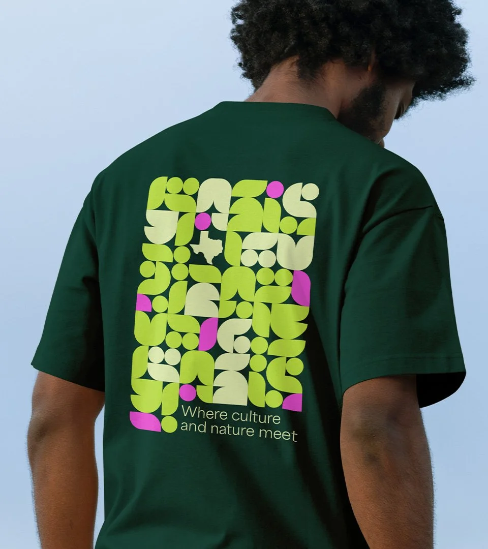
As part of a pro bono brand pitch for the garden, we developed a refreshed identity concept that aimed to preserve the institutions already established heritage and charm, while introducing a more contemporary visual presence. Inspired by the vibrant landscapes and culture of Dallas, the identity system combined bold typography, a vibrant color palette, and organic shapes. The result is a new refreshed brand identity that feels modern and deeply rooted in nature.
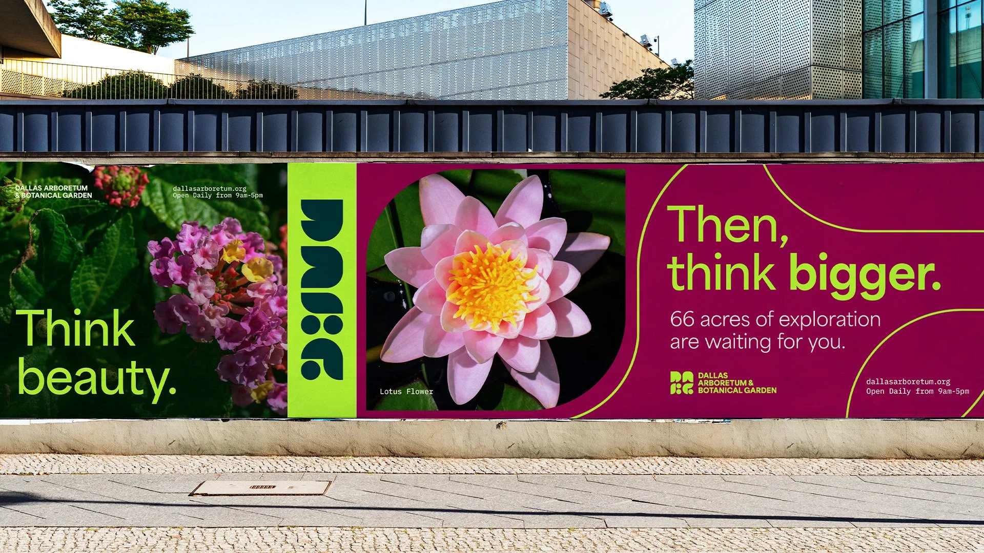
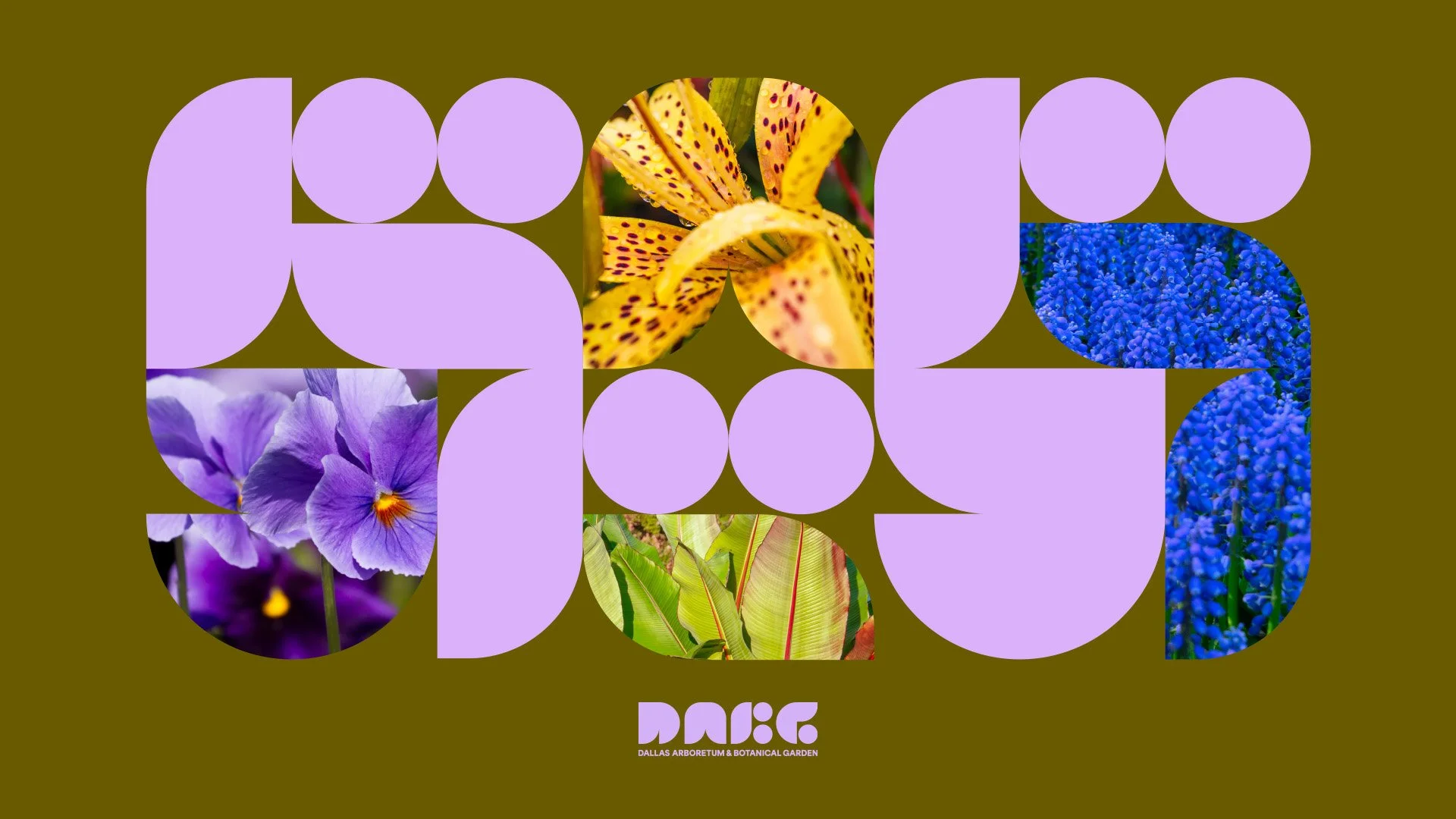
LOGO & WORDMARKThe logo and wordmark have been thoughtfully designed to reflect the garden’s dynamic nature. Aerial shots of the land revealed organic, flowing shapes forming this new identity’s foundation. This creative approach centers on modernizing the brand. By abbreviating the brand name, we’ve aligned it with a growing trend in branding that emphasizes simplicity and recognition in a fast- paced world. We aim to capture the essence of constant transformation while adding a fresh, contemporary flair.
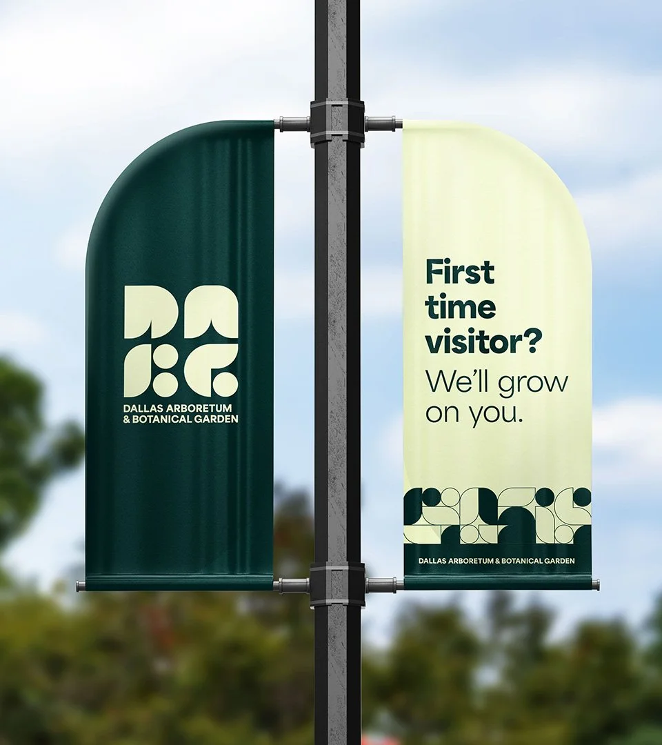
COLOR PALETTEThe palette we’ve crafted is directly informed by nature, reflecting the beauty and visual stimulation of the garden. Green, the most common color in nature, is naturally this palette’s dominant color. The secondary colors are drawn from other aspects of the garden’s diversity—such as the hues of petals, lush plant life, and location-specific references— adding depth and balance. To ensure flexibility and adaptability, we’ve created multiple versatile color pairings that allow the brand to thrive in any context.