Glow Studios is an unconventional beauty brand rooted in the belief that beauty begins within and radiates outward. Built to challenge traditional beauty norms, Glow embraces individuality, self-expression, and the idea that confidence is what helps you shine.
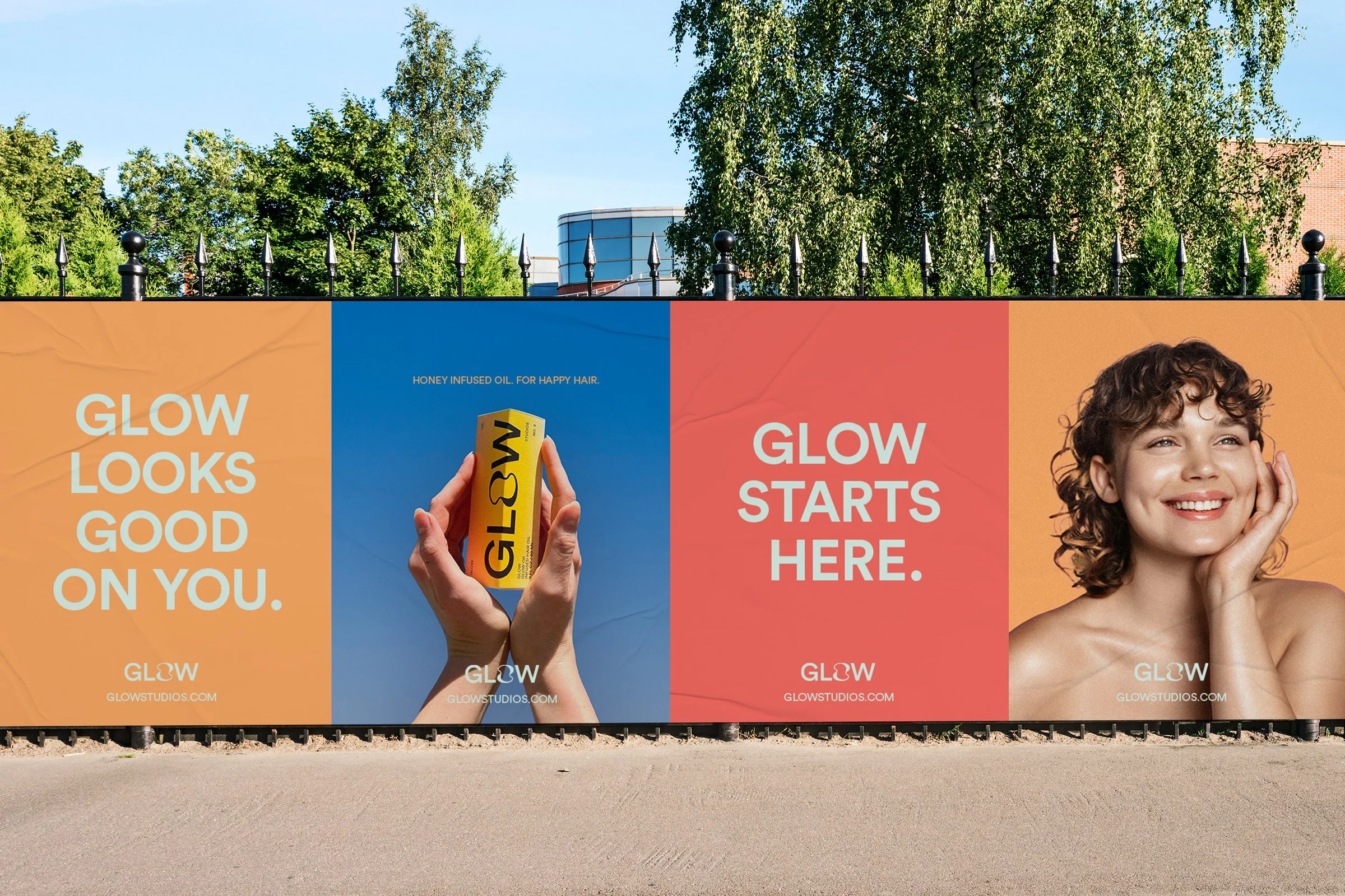
The result is a brand identity that reflects Glow Studios’ distinct ethos, one that breaks away from conventional beauty standards and instead defines its own. The identity needed to feel bold, playful, and approachable, and resonate with a modern audience seeking authenticity, self-care, and empowerment.
Role
Graphic Designer
What we did
Visual Identity, Packaging Design
Glow Studios
Visual Identity
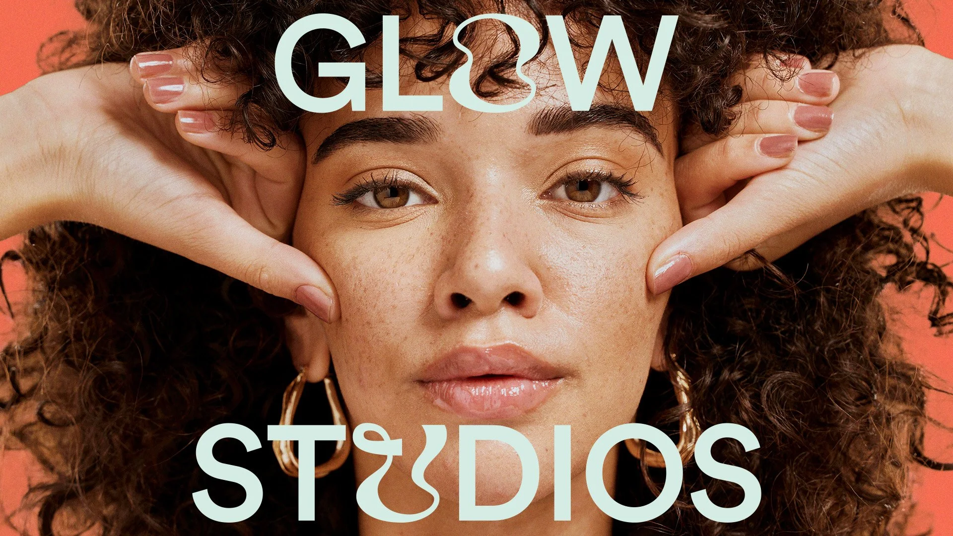
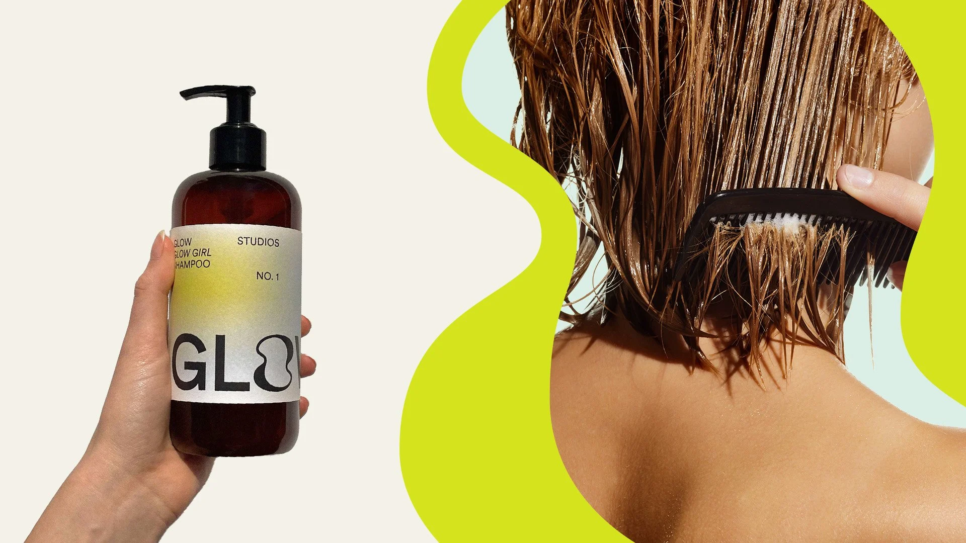
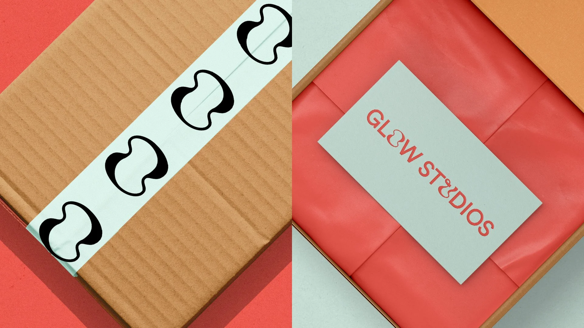
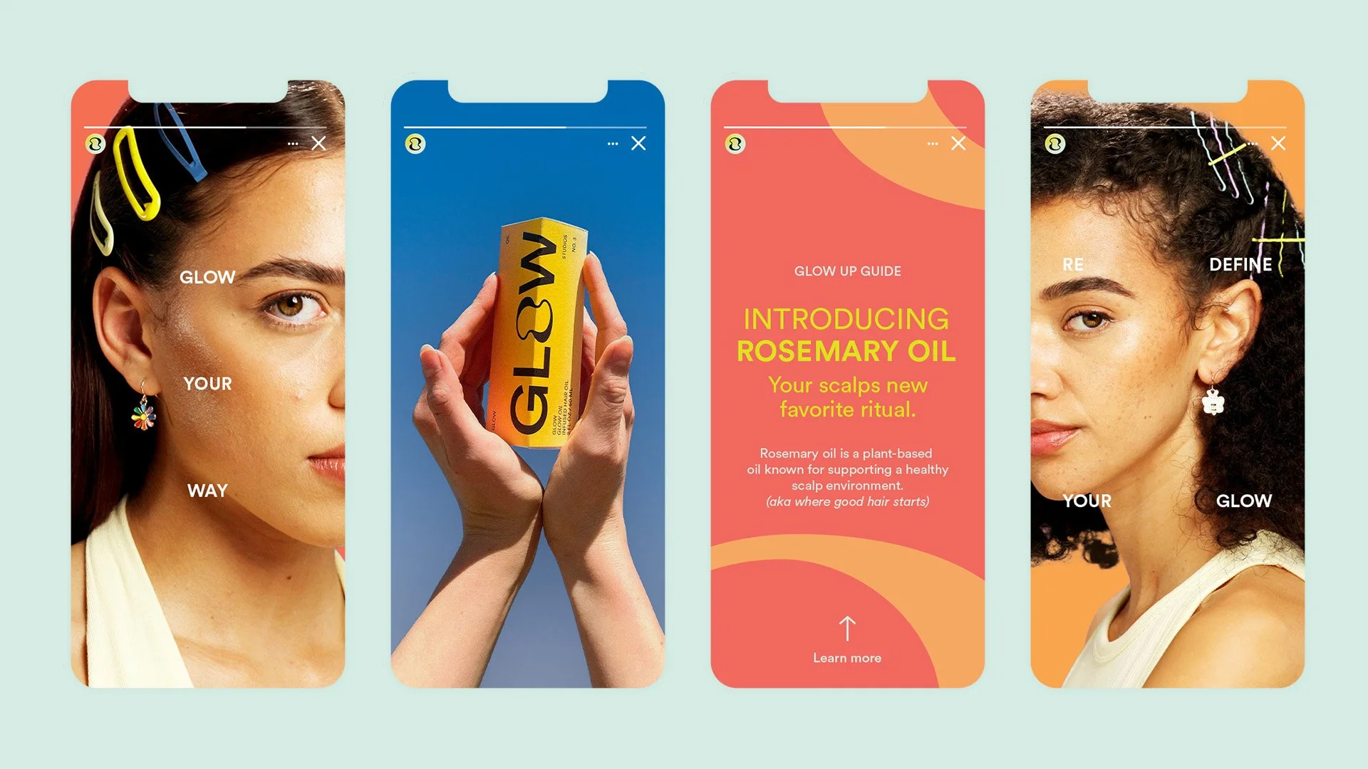
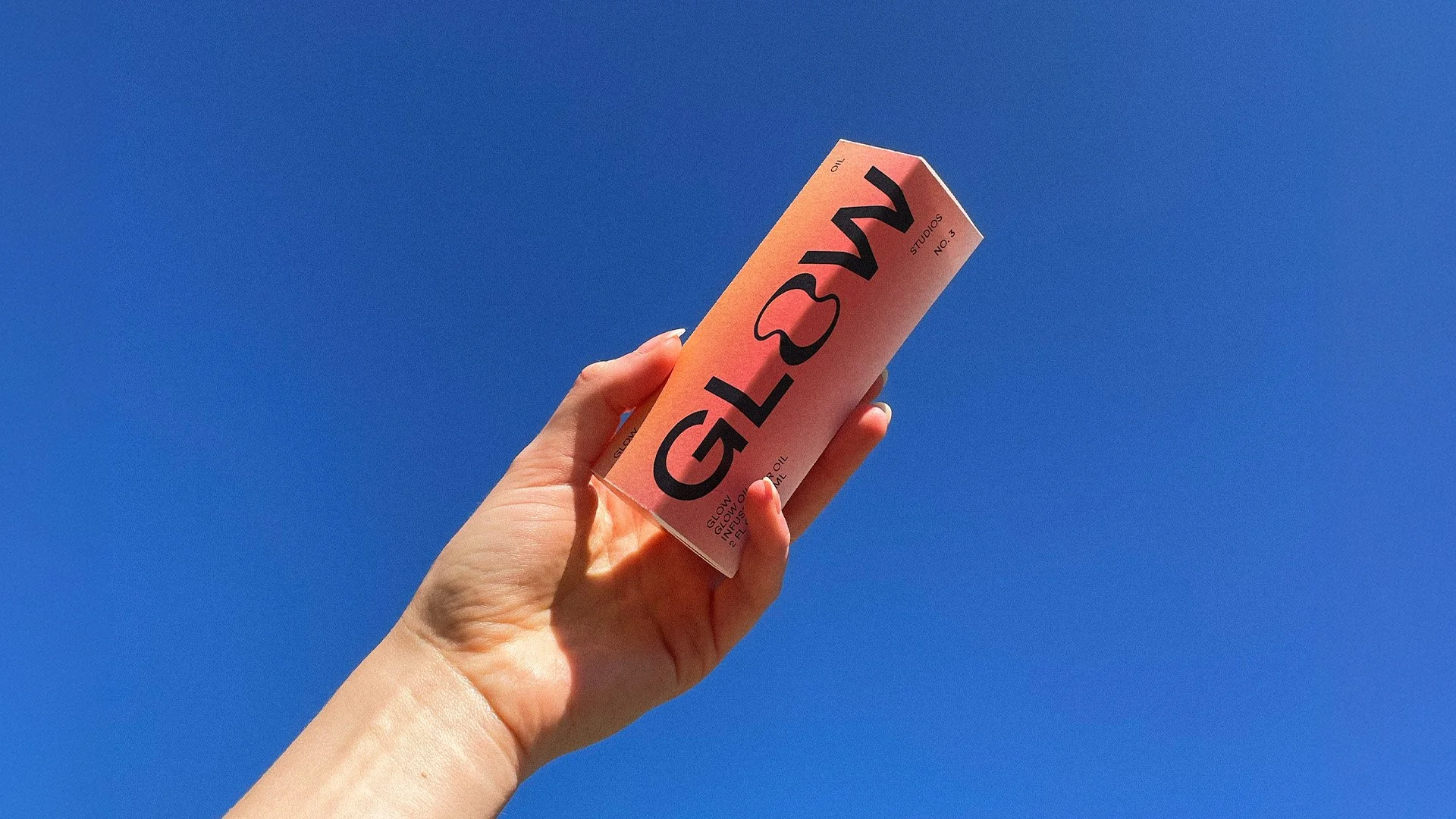
IDENTITY SYSTEMThe identity system was designed to feel playful, curious, and unexpectedly fun. Custom letterforms “O” and “U” introduce a sense of individuality within the logo, reinforcing the idea of standing out rather than blending in.
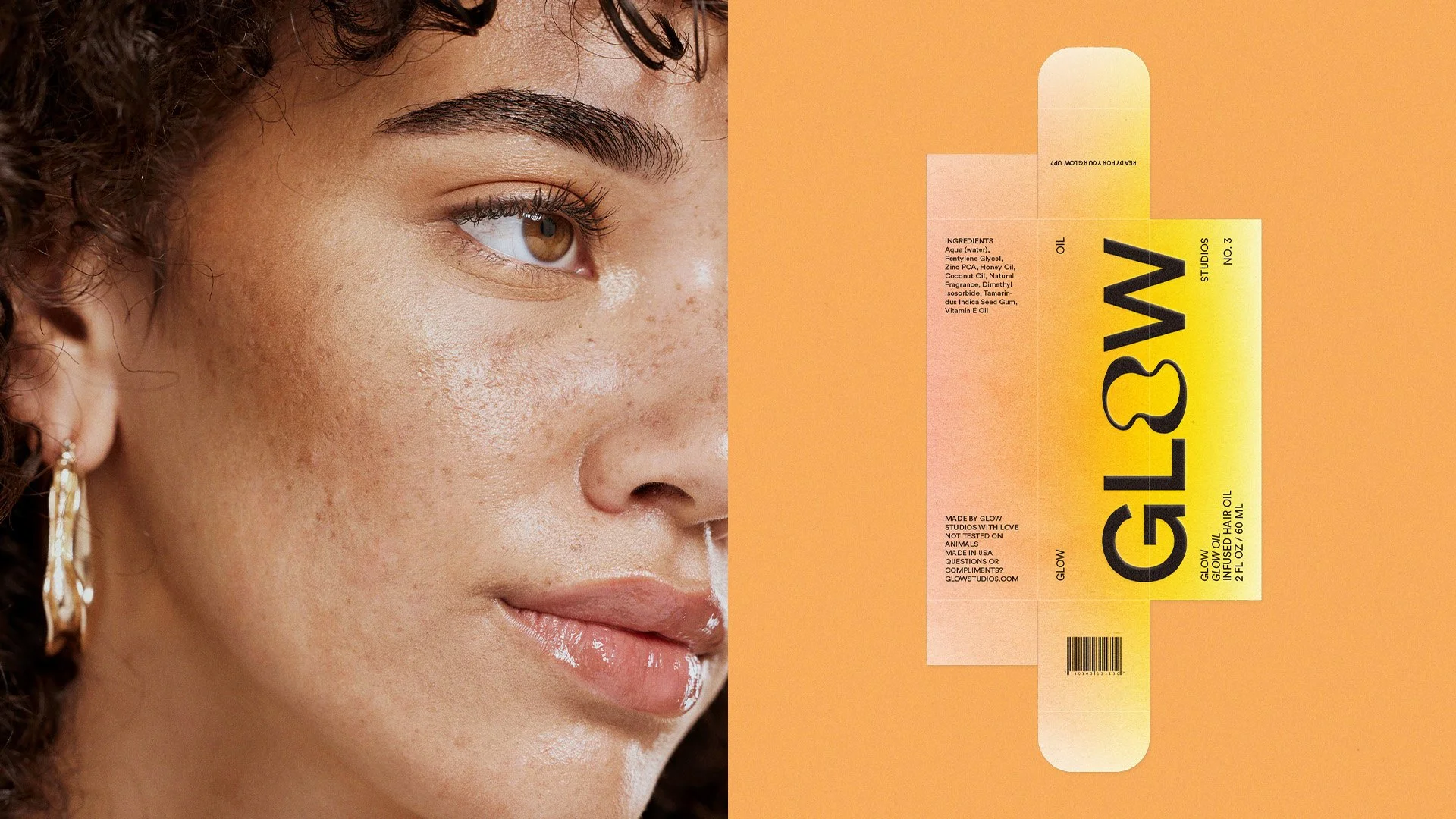
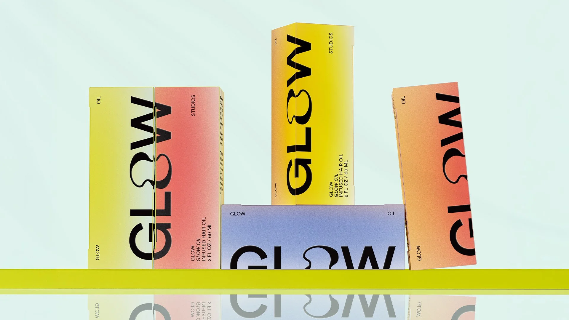
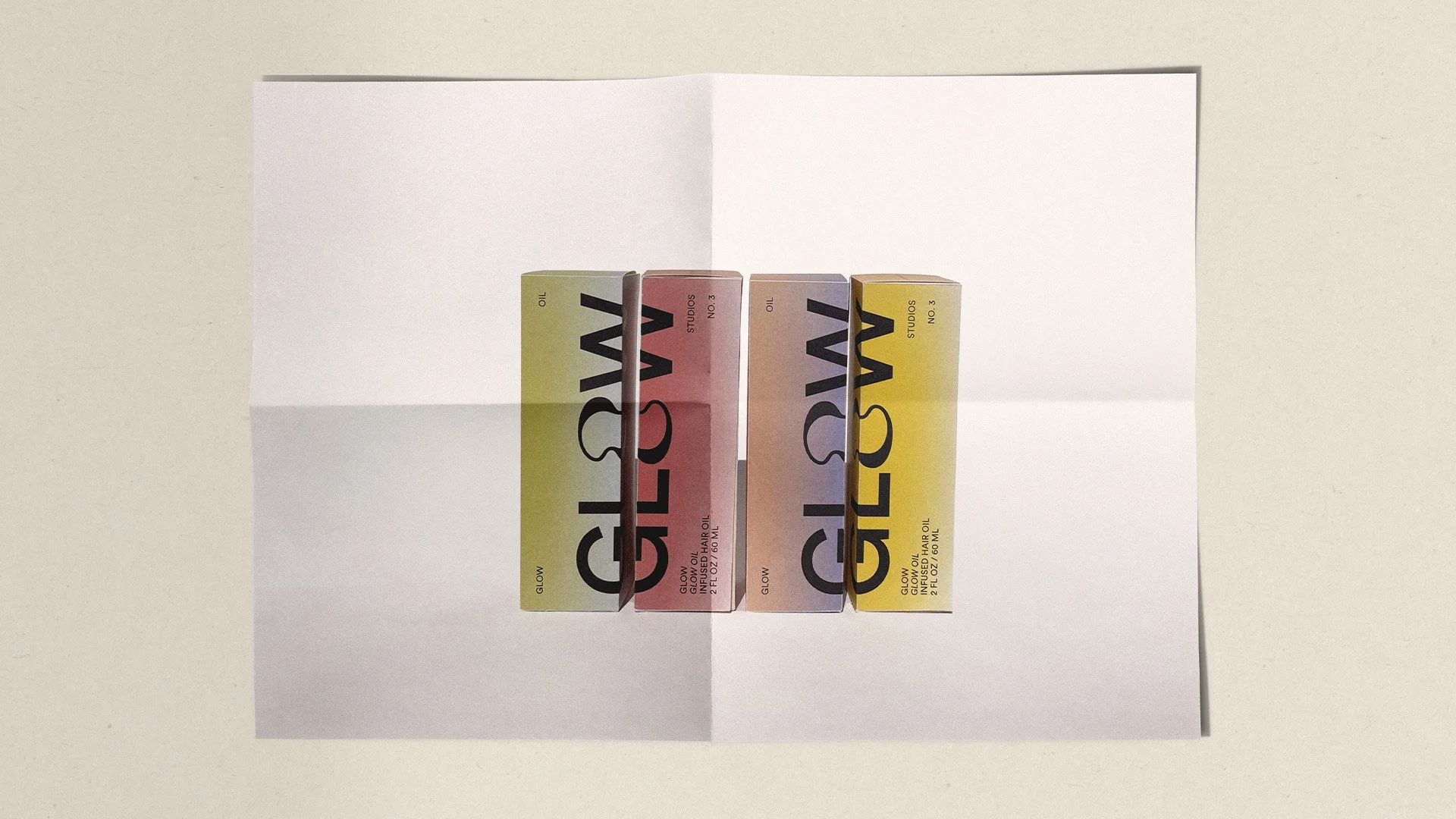
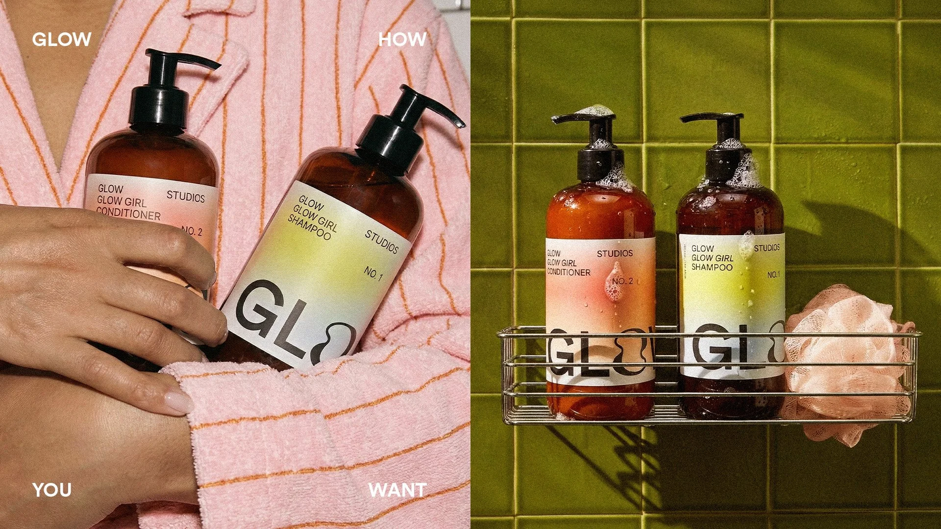
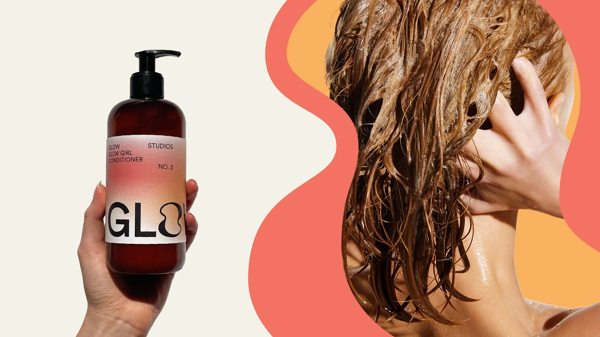
Packaging became an extension of the brand experience, inviting interaction. Each element was intentionally designed to be handled, turned, and explored. As the consumer twists the bottle or box, soft gradients shift with movement, catching light and guiding the eye across the surface. A system of gradients distinguishes each product line, using color to communicate ingredients and benefits, like calming sea minerals and nourishing healing honey. The result is a brand that feels alive, tactile, and aligned with Glow’s philosophy.
PACKAGING